TikTok has rapidly become one of the most popular social media platforms globally, with its captivating short-form videos that combine entertainment, creativity, and engagement. Behind every TikTok video lies a unique visual identity, and one key element contributing to that identity is the font used for text. If you’ve ever wondered about the font TikTok uses for its text, you’re in the right place.
This article will explore the main font TikTok employs, its history, how you can use it, and the other font options available within the app. By the end of this article, you’ll be able to understand and leverage TikTok’s fonts to enhance your own content.
What is the TikTok Font?
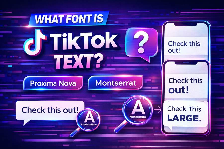
TikTok primarily uses TikTok Sans for its text. This custom typeface was specifically designed for the platform to offer better readability and a unique visual identity. The font is optimized for digital screens, ensuring it looks clear and crisp, especially on mobile devices where TikTok’s content thrives.
TikTok Sans was introduced in 2023 as part of the platform’s effort to refine its brand. It replaced Proxima Nova, which was the font TikTok initially used. The new font is free to use under the SIL Open Font License, which makes it widely accessible for personal and commercial use. Whether you’re creating TikTok content or designing outside the app, TikTok Sans is a go-to font for modern, sleek designs.
The font’s design balances geometric and humanistic features, offering a clean, approachable look that aligns perfectly with TikTok’s energetic, user-driven content. It’s available in several weights, allowing for a range of expressive possibilities from headlines to smaller captions.
The Importance of TikTok Sans in Branding
Since TikTok Sans was introduced, it has played a crucial role in defining the platform’s visual aesthetic. The clean lines, rounded corners, and subtle warmth of the font make it instantly recognizable, helping to differentiate TikTok from other social media platforms. Its legibility ensures that text is easy to read even in the fast-paced, visually dense environment of TikTok videos.
The success of TikTok Sans also highlights how fonts can shape the personality of a brand. TikTok has embraced a font that not only serves its functional purpose—making text legible on all devices—but also supports the vibrant, creative spirit that characterizes the platform. TikTok Sans has become more than just a technical element; it’s part of the platform’s DNA.
Where to Get TikTok Sans
If you want to use TikTok Sans for your own projects, you’re in luck—it’s available for free. You can download TikTok Sans from Google Fonts. It’s free to use for both personal and commercial projects, making it an ideal choice for designers, content creators, and businesses looking to leverage TikTok’s visual identity in their branding.
When using TikTok Sans, you can experiment with different weights and styles, tailoring the font to fit your specific design needs. It’s perfect for everything from mobile app interfaces to marketing materials, ensuring consistency with TikTok’s own branding.
A Look at Other TikTok Fonts
Though TikTok Sans is the primary font for TikTok text, the app offers several other font options that users can apply to captions and text overlays. Each of these fonts serves a different creative purpose, allowing users to express themselves in diverse ways. Here’s a look at some of the other popular fonts available on TikTok:
- Classic: Based on Proxima Nova, this is the default font for most TikTok content. It’s clean, modern, and highly legible, making it a safe choice for a wide range of videos.
- Handwriting: A playful, cursive-style font that adds a personal touch to your videos. It’s perfect for casual, friendly, and relatable content.
- Typewriter: A retro-inspired font that evokes a sense of nostalgia. It’s ideal for videos that have a vintage or quirky feel.
- Serif: This font adds a classic and sophisticated flair to your content. It’s perfect for content that requires a more formal or refined aesthetic.
Each of these fonts offers a unique style, and creators can switch between them depending on the mood they want to convey in their videos. TikTok’s flexibility with fonts enhances the platform’s creative freedom, allowing users to truly make their content their own.
How TikTok Sans Stands Out From Other Fonts
When compared to other popular fonts used on social media platforms, TikTok Sans holds a distinct edge. Many social media platforms rely on simple sans-serif fonts like Helvetica or Arial, but TikTok Sans offers something more. Its slightly rounded edges and humanistic design make it more approachable and dynamic, without sacrificing readability.
TikTok Sans combines the best elements of modern typography: it’s clean, minimal, and functional but also carries a sense of warmth that makes it more inviting than other fonts. Unlike many standard fonts that can feel flat or impersonal, TikTok Sans brings a touch of personality while maintaining clarity, ensuring that the text doesn’t distract from the visuals.
In a world where the competition for user attention is fierce, TikTok Sans ensures that text remains readable and visually appealing, even in the fast-scrolling environment of TikTok’s mobile app. This balance between aesthetics and functionality is what sets it apart from other fonts.
How to Use TikTok Sans in Your Designs
Using TikTok Sans in your own design projects is simple. Whether you’re creating TikTok content or designing graphics for social media, you can incorporate this font in a variety of ways. If you’re working within TikTok’s app, you can easily apply TikTok Sans to captions and overlays directly from the font options.
For more advanced design work, you can download TikTok Sans from Google Fonts and use it in software like Adobe Photoshop, Illustrator, or Canva. With its free availability, you can integrate TikTok Sans into everything from website design to branding projects.
When using TikTok Sans, it’s important to consider the weight and size of the font. The font offers various weights, which can be adjusted to create emphasis or hierarchy within your designs. For example, you can use bold weights for headlines and lighter weights for body text, ensuring a balanced and visually engaging layout.
For those interested in using TikTok’s creative features, tools like the free Glitch Text Generator can help you add a unique twist to your content. It offers fun ways to customize your text and add a little flair to your designs.
Why TikTok Sans Has Become a Trendsetter
TikTok Sans has not only become a core part of TikTok’s identity but also a trendsetter in the design world. Its popularity has influenced the way other platforms think about typography. The font’s versatility and modern design have made it a go-to choice for designers looking to create clean, accessible, and stylish digital content.
The rise of TikTok has made TikTok Sans more than just a font—it’s become a cultural icon. As TikTok’s influence spreads across various industries, more and more brands are adopting similar design elements to evoke the same dynamic and fresh feel that TikTok Sans provides. TikTok’s impact on digital design trends is undeniable, and its font has become an integral part of that legacy.
Conclusion
In conclusion, TikTok’s use of TikTok Sans has revolutionized the way fonts are perceived in the digital world. The font’s unique balance of readability, modern design, and personality has made it a standout choice for content creators, designers, and marketers. Whether you’re creating TikTok videos or working on a broader design project, TikTok Sans offers the perfect balance of style and functionality.
By understanding how TikTok Sans works and how to implement it effectively in your own content, you can create designs that resonate with your audience and enhance your creative projects. TikTok Sans is more than just a font—it’s a key element in the platform’s branding, and by using it, you can tap into the visual language that defines one of the world’s most influential apps.